
A Refined, Nature-inspired Palette
Restraint is the whole idea. Black and white do most of the work; each hue is drawn from nature, so Scale reads as real and reliable everywhere it appears. Color works hardest as a backdrop — a single brand color can carry a layout or a deck, with everything on it kept black and white. Multiple colors can share a layout, but only in the smallest doses: an icon background, a shape in a diagram. Pair every color with black or white, and never stack two brand colors.
Color in practice
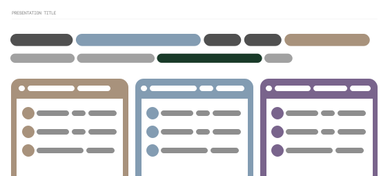
A few patterns that keep color feeling intentional — color as the surface, always paired with black or white, and kept to small functional moments.


What to avoid
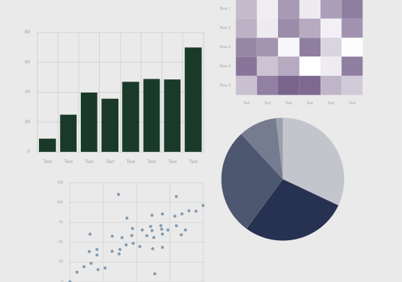
The fastest ways color stops feeling like Scale: stacking brand colors, leaning on color for contrast or emphasis, and spreading it too thin.
Download the assets
Production-ready marks, tokens, and templates referenced in this chapter.