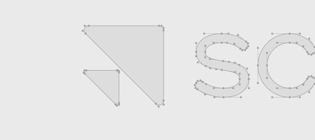
Anatomy of the logo
Our symbol and wordmark combine into a cohesive logo lockup. Use them together, in the horizontal lockup by default, or the vertical lockup where the application is square or otherwise constrained. Toggle to compare the two.
Horizontal: the primary lockup. Use it for most applications, including site headers, decks, and documents.
- Symbol
- The triangular mark. It stands alone only at small sizes, like favicons and avatars. (See below)
- Wordmark
- The Scale logotype, drawn as custom lettering as a single continuous stroke with rounded terminals.
- Logo lockup
- The symbol and wordmark together fixed in proportions form each respective lockup.
Using the symbol as an avatar
We keep the symbol and wordmark together in a lockup whenever possible. Exceptions can be made for legibility in high brand context situations, like system icons, profile pictures, or favicons.
Don't use the symbol alone on merchandise, stickers, or alongside a Scale subsidiary or department name.
Size the symbol to 50% of the avatar canvas, then center it. On a 400px canvas, the symbol is 200px.
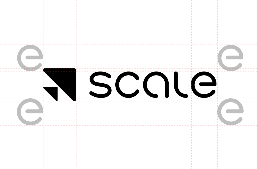
Logo Clearspace Guidance
The wordmark should never feel too crowded, and should always be surrounded by clear space, measured in “e” units, the height of the lowercase e in the wordmark. Keep at least 1e on all four sides; more is better.
- Minimum: Maintain 1e of clear space on all four sides.
- Optimal: Increase the distance to let the logo breathe.
- No-go zone: No other logos, type, or imagery enters this zone.
What not to do
Consistency builds trust. Keep the mark unmodified so it communicates with the reliability we build into our technology.

Don’t use the wordmark alone without the symbol.
Don’t stretch or skew the logo unproportionally.
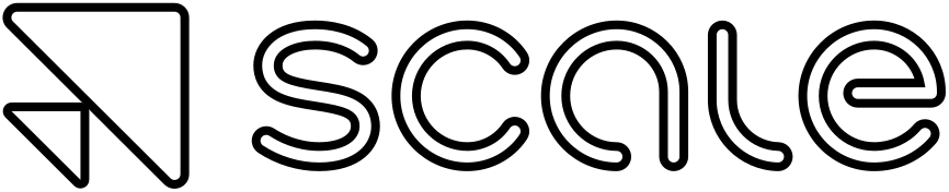
Don’t add strokes or gaudy effects to the logo.
Don’t rotate the logo.
Don’t use unapproved colors or gradients.

Don’t use the old logo.
Partner lockups
To present a cohesive co-brand, a vertical divider separates Scale from our partners. When using the primary wordmark, the “e” unit is the mathematical anchor: the gap between the Scale wordmark and the partner is exactly 3e wide. Toggle the guides to see the construction.
Partner marks differ in weight and proportion, so every lockup needs an optical-balance check — and Brand review before it ships.
For all-caps marks with uniform letter height, align the partner to the Scale wordmark’s cap height and baseline.
- Divider
- A vertical rule sits in the center of the 3e gap for horizontal logos and 5e for vertical logos — 1.5e or 2.5e from each logo.
- Divider height
- For horizontal lockups, 2e tall, centered so it extends 0.5e above cap height and below the baseline. For vertical lockups, 3e tall, placed just above the top of the Scale wordmark.
- Alignment
- Once the partnership lockup is complete, center the whole composition horizontally. Some optical alignment may be necessary.
Download the logo
Hover a lockup to download it as SVG or PNG, or copy it straight to your clipboard.
Download the assets
Production-ready marks, tokens, and templates referenced in this chapter.